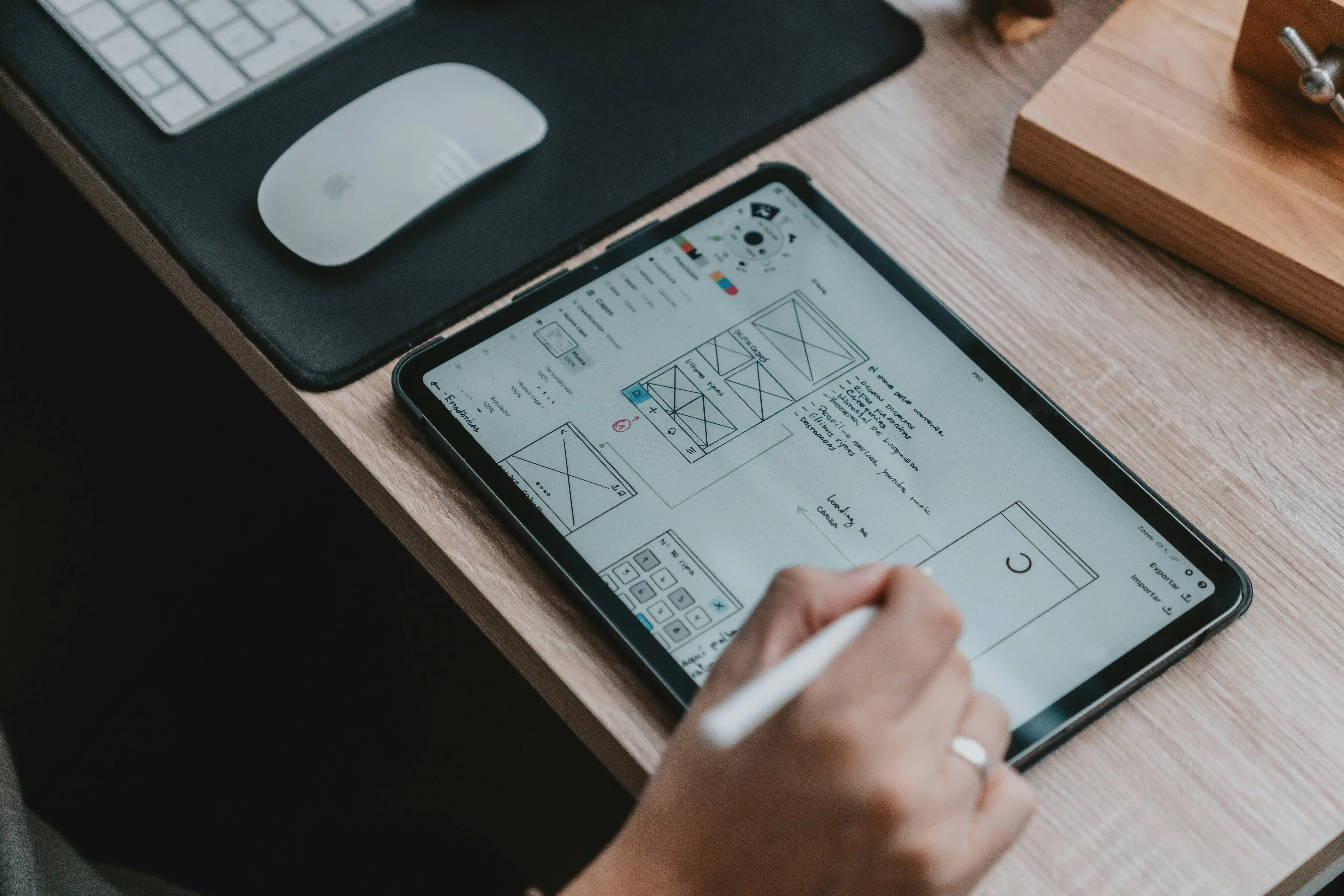
Mobile-Friendly Websites: Why It's No Longer Optional
A customer finds your online store through Google. They tap the link on their phone. The page loads slowly. The text is too small to read. The buttons are hard to tap. The checkout is confusing on a small screen.
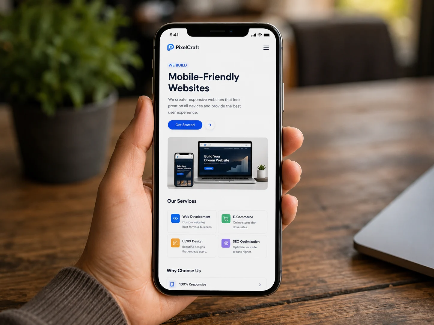
A customer finds your online store through Google. They tap the link on their phone. The page loads slowly. The text is too small to read. The buttons are hard to tap. The checkout is confusing on a small screen.
They close your store and buy from your competitor instead.
This is happening to thousands of businesses across India every single day — not because their products are bad, but because their website was not built for the device their customers are using.
In 2026, more than 75% of internet users in India browse and shop on mobile phones. If your website is not built to work perfectly on mobile, you are not just losing visitors — you are actively losing sales, customers, and revenue every hour your store is live.
This article explains why mobile-friendly design is now the single most important feature of any website or ecommerce store — and what you can do about it.
What Does "Mobile-Friendly" Actually Mean?
A mobile-friendly website is one that looks great, loads fast, and works perfectly on a smartphone or tablet — without the user needing to zoom in, scroll sideways, or struggle with tiny buttons.
There are two approaches to mobile-friendly design:
Responsive Design — The website automatically adjusts its layout depending on the screen size. One website, built once, that works beautifully on every device — desktop, tablet, and mobile.
Mobile-First Design — The website is designed for mobile screens first, then scaled up for larger screens. Since most of your visitors are on mobile, this approach puts them first from the very beginning.
Both approaches are far better than what many businesses still have — a website designed only for desktop that technically loads on mobile but is painful to use.
Why Mobile-Friendliness Is Now Non-Negotiable
India Is a Mobile-First Country
India has over 800 million smartphone users. In states like Kerala, mobile internet penetration is among the highest in the country. The majority of product searches, price comparisons, and online purchases now happen on mobile devices — not laptops or desktops.
When a customer wants to buy something, they reach for their phone first. If your ecommerce store does not give them a smooth experience on that phone, the sale does not happen.
Google Ranks Mobile-Friendly Sites Higher
Since 2019, Google uses mobile-first indexing. This means Google looks at the mobile version of your website — not the desktop version — to decide how high you rank in search results.
A website that performs poorly on mobile will rank lower than a competitor with a mobile-optimised site, even if your content is better. For ecommerce businesses trying to get found on Google, this is critical. Poor mobile performance does not just hurt your user experience — it directly hurts your visibility.
Slow Mobile Sites Lose Customers Instantly
Speed matters enormously on mobile. Research shows that 53% of mobile users abandon a website that takes more than 3 seconds to load. On a slow mobile connection — which is still common across many parts of India — a poorly optimised website can take 8 to 10 seconds to load.
Every second of delay costs you customers. A mobile-optimised ecommerce store loads fast, even on slower connections, because the images are compressed, the code is clean, and the architecture is built for performance.
What Happens When Your Website Is Not Mobile-Friendly
It helps to be specific about what poor mobile experience actually costs you.
You lose Google rankings.
A non-mobile-friendly website ranks lower in search results, which means fewer people find you in the first place.
You lose visitors immediately.
A slow or difficult-to-use mobile experience sends visitors away within the first few seconds — before they even read what you offer.
You lose enquiries.
If your contact form is hard to fill on mobile, if your phone number is not clickable, if your call-to-action buttons are too small to tap — visitors who wanted to reach you simply will not bother.
You damage your brand.
A poor mobile experience tells visitors — consciously or unconsciously — that your business is not professional or trustworthy. It creates doubt before any conversation is even had.
You hand customers to competitors.
Every visitor who leaves your website because of a poor mobile experience does not disappear. They go to a competitor whose website works on their phone — and they contact them instead.
The 6 Elements of a Truly Mobile-Friendly Website
Not all mobile-friendly websites are equal. Here is what separates a genuinely great mobile experience from one that is just passable.
1. Fast Load Speed on Mobile
Every image is compressed. Every unnecessary script is removed or deferred. The server responds quickly. Pages load in under 3 seconds, even on a 4G connection. Speed is not optional — it is the foundation of every other mobile experience.
2. Thumb-Friendly Design
Buttons are large enough to tap comfortably. Navigation menus open smoothly. Forms are easy to fill in with a mobile keyboard. Nothing requires a precision tap that a finger cannot reliably make. Good mobile design is designed for how humans actually hold and use phones.
3. Readable Text Without Zooming
Text is large enough to read without squinting. Line spacing is comfortable. Content is not crammed into tiny columns. A visitor should be able to read every word on your website without pinching the screen to zoom in.
4. Simple and Clear Navigation
Menus are easy to open and use on a small screen. Pages are easy to move between. Visitors can find what they are looking for — your services, your contact details, your location — in seconds, without confusion or frustration.
5. Easy-to-Use Contact and Enquiry Forms
This is critical for any business website. Contact forms should be short, simple, and easy to fill on a mobile keyboard. Phone numbers should be clickable — one tap to call. WhatsApp buttons, callback request forms, and clearly visible CTAs should all work flawlessly on mobile. Making it easy to get in touch on mobile is one of the highest-impact improvements any business website can make.
6. Consistent Experience Across All Devices
Your website should look and feel equally impressive on a budget Android phone, an iPhone, a tablet, and a desktop. A responsive website built properly delivers this consistency without compromise.
Mobile-Friendliness and SEO — The Connection Most Businesses Miss
Many businesses invest in SEO — writing service pages, building backlinks, setting up Google Ads — without realising that their mobile experience is quietly undermining all of that effort.
Here is why: Google measures Core Web Vitals — a set of performance metrics that include how fast your page loads, how stable the layout is, and how quickly users can interact with it. These measurements are taken from mobile devices. A poor score directly reduces your search ranking.
Google also measures user behaviour signals. If visitors from search results land on your website and immediately leave because the mobile experience is poor, Google interprets that as a sign that your page did not satisfy the search. Over time, this pushes your ranking lower.
The bottom line: mobile performance is SEO. You cannot separate them. Every rupee you spend on SEO is working at reduced effectiveness if your mobile experience is poor.
How Vincora Builds Mobile-First Websites
Vincora is a website development company based in Thodupuzha, Kerala, building fast, responsive, and SEO-ready websites for businesses across India. Every website we build is designed mobile-first — not as an afterthought, but as the foundation of the entire project.
Here is what that means in practice:
Responsive design built from scratch — No templates, no shortcuts. Every screen, every element, every interaction is designed specifically for the device it will be viewed on.
Performance-optimised from day one — Compressed images, clean code, CDN integration, and fast hosting are standard in every build we deliver — not premium add-ons.
Contact-ready on mobile — We design every website so that getting in touch on mobile is effortless — clickable phone numbers, simple enquiry forms, WhatsApp integration, and strategically placed call-to-action buttons on every key page.
Tested on real devices — Before any website goes live, we test across multiple Android and iOS devices to ensure the experience is consistently excellent — not just on a simulator.
Built for Google — Technical SEO is built into every website we develop — clean URLs, schema markup, fast load speeds, mobile meta optimisation, and Core Web Vitals compliance — giving your website the strongest possible foundation in search results from day one.
We have delivered 200+ websites for businesses across Kerala and across India — from simple business websites to complex web applications — all built to perform perfectly on every device your customers use.
👉 See how Vincora builds mobile-first websites — vincora.in/services/web-development/
Quick Checklist: Is Your Website Mobile-Ready?
Run through these questions for your own website right now:
✅ Does your website load in under 3 seconds on mobile?
✅ Can you read all text without zooming in?
✅ Are all buttons easy to tap with a thumb?
✅ Does your contact form work smoothly on a smartphone?
✅ Is your phone number clickable with one tap?
✅ Does your website look good on both Android and iPhone?
✅ Is your Google PageSpeed mobile score above 80?
Conclusion
Mobile-friendly design is not a feature you add to a website. It is the standard every business website must meet in 2026 — because it is the standard your customers already expect.
In India's mobile-first market, where potential customers are searching and making decisions primarily on their phones, a website that does not perform on mobile is a website that is working against your business. It costs you search rankings, it costs you first impressions, and it costs you enquiries you never even knew you missed.
The good news is that getting this right is entirely possible — with the right website development partner who builds mobile-first from day one.
👉 Build a mobile-first website with Vincora — vincora.in/services/web-development/